Careerflow360
Turning a fragmented college-planning journey into a connected path from Career → Major → College → Application
Survey Snapshot
01
Overview
Choosing a college is rarely just a college-search problem.
Students and parents are trying to answer several connected questions at once:
What career should I pursue?
What major leads there?
Which colleges are a good fit?
What will it cost?
What is the potential return on that investment?
What scholarships are available?
What deadlines do I need to track?
Yet these decisions are typically spread across multiple websites, spreadsheets, ranking platforms, college websites, career resources, scholarship databases, and application portals.
I designed CareerFlow360 as a unified experience that connects the journey fromcareer exploration to major selection, college discovery, ROI understanding, scholarships, and application planning.
The goal was not simply to build another college-search tool.
The goal was to reduce the cognitive load of a complex, high-stakes decision.
02
The Challenge
College planning is fragmented
Students may begin with a college search.
Parents may begin with tuition.
Another family member may focus on rankings.
A student may be interested in a particular career but have no idea which major supports it.
Meanwhile, important information is distributed across different sources.
This creates a fragmented journey:
Career exploration
Major research
College research
Cost
ROI
Scholarships
Applications
The user is responsible for connecting all of those dots.
The opportunity
I saw an opportunity to design a product that could connect these decisions into a single, personalized journey rather than treating each activity as an isolated task.
[INSERT IMAGE — fragmented journey diagram]
Optional: before-state journey sketch
03
The Design Question
How might we help students and families move from uncertainty to confident education and career decisions?
Instead of asking:
“How can we help students find colleges?”
I reframed the problem around the larger decision.
Career → Major → College → Career Outcome
This became the foundation for CareerFlow360's product strategy.
04
My Role
I worked across the end-to-end UX process, including:
- User research
- Research synthesis
- Personas
- Empathy mapping
- Journey mapping
- Problem framing
- Product strategy
- Information architecture
- User flows
- Wireframing
- UI design
- Design system
- High-fidelity prototyping
- Usability testing
- Iteration
The project was developed as an independent product concept.
[VERIFY/ADD: project timeline]
[VERIFY/ADD: whether you worked independently or with collaborators]
05
Research
Before designing, I wanted to understand the decision—not just the interface.
I conducted research with 26 participants to understand how students and families approach college and career decisions.
Research objectives
I wanted to understand:
- How students choose colleges.
- How parents influence the decision.
- Whether students have already selected a career or major.
- What information families consider most important.
- How families evaluate college value and ROI.
- Where users currently obtain information.
- What makes the process confusing or overwhelming.
- What information users wish they could see together.
[VERIFY/ADD: exact research method and participant breakdown]
[INSERT IMAGE — research artifacts / synthesis]
Affinity map, interview notes collage, etc.
06
What I Learned
Three findings became particularly important to the product direction.
01
ROI influences college decisions
83%
of students said ROI influences their college choice.
This challenged the assumption that college discovery is primarily about rankings, location, or prestige.
CareerFlow360 needed to connect college selection with potential career outcomes and financial considerations.
02
Many students are still uncertain about their major
67%
of parents reported that their child had not finalized a major.
This revealed an important problem with a traditional college-search experience.
If a student doesn't know what they want to study, asking them to begin with:
“Which college do you want?”
is backwards.
Career exploration and major discovery needed to happen before or alongside college discovery.
03
Information is scattered
73%
of participants relied on multiple websites to research college and career decisions.
Users were stitching information together themselves.
The product needed to become a decision hub, not simply another search destination.
07
From Research to Product Strategy
The research changed how I thought about the product.
Instead of designing:
College Search
I designed around:
Decision Journey
The connected model
Career
Major
College
ROI / Cost
Scholarships
Application
This became one of the central principles behind CareerFlow360.
The product should help users understand not only:
“Which college should I consider?”
but:
“How does this college fit into the future I am trying to build?”
08
Personas
Research revealed that CareerFlow360 needed to support multiple perspectives.
Student
The student wants to understand:
- What careers might fit me?
- What majors lead to those careers?
- Which colleges offer those programs?
- What will my options look like after graduation?
- How do I organize the application process?
Primary need: Clarity and confidence.
Parent
Parents often focus on:
- Cost
- ROI
- Safety
- Location
- Scholarships
- Career outcomes
- Application deadlines
Primary need: Trust and decision visibility.
Future ecosystem
The broader product vision also includes:
- Mentors
- Counselors
- Sponsors
- Institutions
These roles create opportunities for CareerFlow360 to evolve beyond a search tool into a broader education and career ecosystem.
[INSERT IMAGE — persona boards]
Student / Parent persona visuals
09
Journey Mapping
The research suggested that college planning is not one task. It is a sequence of interconnected decisions.
Before CareerFlow360
"What career?"
"Which major?"
Search Google
Compare colleges
Visit college websites
Look at rankings
Search scholarships
Track deadlines separately
Try to make sense of everything
The experience creates unnecessary cognitive load.
[INSERT IMAGE — current-state journey map]
Journey map artifact
10
The Opportunity
I designed CareerFlow360 around a more connected journey:
Discover — Explore careers and interests
Understand — Connect careers with relevant majors
Match — Discover colleges aligned with the student's profile and goals
Evaluate — Compare cost, ROI, outcomes, location, and other priorities
Plan — Track scholarships, deadlines, and applications
Decide — Give students and families a clearer path toward a decision
[INSERT IMAGE — future-state opportunity map]
Connected journey diagram
11
Information Architecture
The product architecture was designed around the user's decision-making journey rather than around disconnected tools.
Core experience
- Profile — Student / Parent / Mentor / Counselor
- Career Discovery — Career exploration, career information, job outlook, salary / employment information
- Major Discovery — Major exploration, career connections, major-to-college relationships
- College Search & Match — Search, personalized matching, college comparison
- Financial Planning — Cost, ROI, scholarships / financial aid
- Application Hub — Colleges, deadlines, application status, tasks
- Mentorship — Mentors, counselors, guidance
[INSERT IMAGE — IA / sitemap]
Information architecture diagram
12
Designing the Onboarding Experience
One of the most important parts of CareerFlow360 is onboarding.
The product needs information such as:
- GPA
- Academic interests
- Extracurricular activities
- Intended major
- Career interests
- Budget
- Preferred location
- AP courses
- Other student preferences
But collecting this information creates a UX problem.
The problem
During usability testing, participants understood that information was being requested, but some were uncertain about why CareerFlow360 needed it.
That created friction and reduced confidence during onboarding.
[INSERT IMAGE — onboarding wireframes / early UI]
Before-state onboarding
13
Usability Testing
I conducted task-based usability testing with 5 participants using athink-aloud protocol.
Testing approach
Participants were asked to complete realistic tasks while verbalizing their thoughts, expectations, confusion, and decision-making.
I observed:
- Where users hesitated
- What they expected to happen
- What terminology confused them
- Where they questioned why information was required
- Whether the interface communicated the value of each step
[VERIFY/ADD: exact task list]
14
Key Usability Finding
Users didn't fully understand the value of the information they were providing.
The issue wasn't simply:
“The form is too long.”
The deeper problem was:
Users didn't always understand how their answers would improve their CareerFlow360 experience.
This distinction mattered.
Reducing the number of fields might make the form shorter—but it wouldn't necessarily increase trust.
15
Design Response
I redesigned the onboarding experience to make the relationship between:
Question → Purpose → Personalized value
more explicit.
Design improvements included:
- Clearer helper text
- Examples where users might be uncertain
- Stronger visual hierarchy
- Progress indication
- More understandable labels
- Visual cues to make sections easier to scan
- Context explaining why information matters
The goal was to transform onboarding from:
“Why are you asking me this?”
into:
“I understand how this will help personalize my experience.”
[INSERT IMAGE — redesigned onboarding]
After-state onboarding UI
16
From Wireframes to High-Fidelity Design
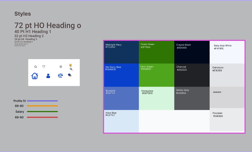
After establishing the product structure and major flows, I translated the experience into wireframes and then high-fidelity UI.
The design system was developed to create consistency across:
- Navigation
- Cards
- Forms
- Search
- Filters
- Data presentation
- Comparison experiences
- Progress states
- Recommendations
- Application tracking
The visual language was designed to make a complex information-heavy product feel approachable rather than overwhelming.
[INSERT IMAGE — wireframes]
Low-fi structure
17
Key Experience: Career → Major → College
One of the core ideas behind CareerFlow360 is connecting decisions that are traditionally separated.
Instead of forcing a student to begin with a college name, the experience can begin with the student's interests and aspirations.
Example journey
"I am interested in AI."
Explore relevant careers
Understand potential career paths
Explore related majors
Discover colleges offering those programs
Compare colleges
Understand cost and potential outcomes
Save schools
Track applications
This creates a much more natural decision flow.
[INSERT IMAGE — career → major → college flow UI]
Connected discovery screens
18
Key Experience: College Matching
CareerFlow360 moves beyond a generic college list.
The goal is to help students evaluate colleges based on their own profile and priorities.
Potential matching factors include:
- Academic profile
- Intended major
- Career interests
- Location
- Budget
- Student preferences
- Programs
- Career outcomes
The experience should answer:
“Why is this college a good match for me?”
rather than simply:
“Here is a list of colleges.”
[INSERT IMAGE — college matching UI]
Match results / rationale
19
Key Experience: Comparison
College decisions often require comparing multiple dimensions simultaneously.
CareerFlow360 brings those dimensions into a more structured experience.
Compare
- Academics
- Programs
- Cost
- ROI
- Career outcomes
- Location
- Other personal priorities
The objective is to reduce the need for users to repeatedly switch between browser tabs and spreadsheets.
[INSERT IMAGE — college comparison UI]
Comparison table / cards
20
Key Experience: Application Hub
Discovery is only the beginning.
Once students begin applying, the problem changes from:
“What should I choose?”
to:
“How do I manage everything?”
CareerFlow360 therefore includes an application hub designed to help users track:
- Colleges
- Deadlines
- Application status
- Tasks
- Scholarships
- Important milestones
This extends the product from discovery into execution.
[INSERT IMAGE — application hub UI]
Deadlines / status tracking
21
The Product Ecosystem
CareerFlow360 was intentionally designed as more than a single college-search screen.
V1 — Core experience
- Smart College Search & Match
- Scholarship & Financial Aid Finder
- AI Career Advisor
- Application Hub & Deadline Tracker
- Mentorship / Counselor Marketplace
V2 — Expansion
- SAT / ACT preparation
- Micro-internships
- Peer study groups
- Enhanced scholarship discovery
- Parent dashboard
- Counselor tools
V3 — Education ecosystem
- Education wallet
- Scholarship disbursement
- Microloans
- Alumni and career network
This roadmap reflects the larger product vision while keeping the initial UX focused on the highest-value user problems.
22
What I Designed
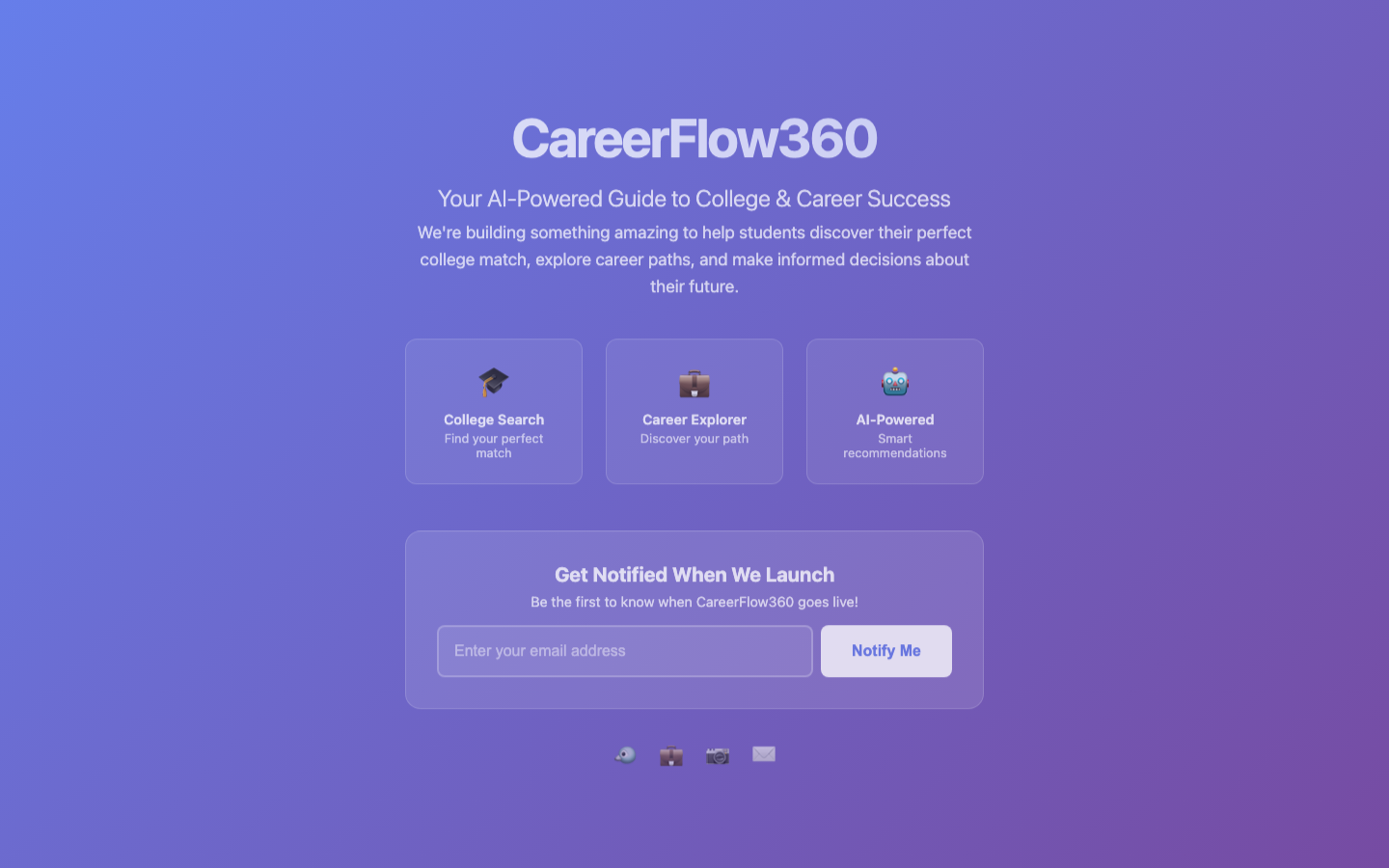
The final design system and high-fidelity experience bring the research and product strategy together.
Key screens
[INSERT ACTUAL SCREENSHOT — onboarding]
Provide final UI screenshot
[INSERT ACTUAL SCREENSHOT — career exploration]
Provide final UI screenshot
[INSERT ACTUAL SCREENSHOT — major exploration]
Provide final UI screenshot
[INSERT ACTUAL SCREENSHOT — college search / matching]
Provide final UI screenshot
[INSERT ACTUAL SCREENSHOT — college comparison]
Provide final UI screenshot
[INSERT ACTUAL SCREENSHOT — application hub]
Provide final UI screenshot
[INSERT ACTUAL SCREENSHOT — scholarship experience]
Provide final UI screenshot
The objective wasn't to maximize the number of screens.
It was to create a coherent experience across the user's decision journey.
23
What Changed Through Testing
The most important learning from usability testing was thatpersonalization creates a trust problem if users don't understand its value.
The more information the product asks for, the more important it becomes to explain:
Why are we asking?
and
What will you get in return?
This influenced the onboarding experience and reinforced a broader product principle:
Personalization should feel useful, not invasive.
24
What I Learned
01
A search problem can actually be a decision problem
Initially, CareerFlow360 could have been treated as a college-search product.
Research pushed the concept toward a broader decision-support experience.
02
Research should change the product
The 26-participant research was not simply an artifact to document the process.
It changed the product direction:
College search became
Career → Major → College → Outcome
03
More data does not automatically create a better experience
Career planning requires a lot of information.
But adding information increases cognitive load.
The UX challenge is not:
“How much information can we show?”
It is:
“What information does the user need at this moment to make a better decision?”
04
Explain the value of personalization
The onboarding usability testing reinforced that users need to understand why their information matters.
This is especially important in AI-powered products.
Trust is part of the UX.
25
What I Would Improve Next
CareerFlow360 is a product concept and therefore does not yet have production-scale business metrics.
I would not claim fabricated conversion, retention, or revenue results.
The next phase of validation would focus on:
- Measure onboarding completion — Does explaining the value of each question improve completion?
- Measure decision confidence — After using CareerFlow360, do students feel more confident about their career, major, and college choices?
- Validate matching quality — Do students and parents agree that recommended colleges are genuinely relevant?
- Test parent/student alignment — Can the product help families identify disagreements and reach a shared decision?
- Validate end-to-end journeys — Can users successfully move from Career → Major → College → Application without unnecessary confusion?
26
Outcome
CareerFlow360 evolved from a college-search concept into a broadercareer and education decision platform.
The strongest outcome of the project was not a collection of high-fidelity screens.
It was the transformation of a fragmented problem into a connected experience:
Career
Major
College
ROI
Scholarships
Application
The project allowed me to work across the full UX lifecycle—from research and problem framing through product strategy, interaction design, UI design, usability testing, and iteration.
27
Reflection
CareerFlow360 taught me that designing for a complex decision is fundamentally different from designing for a simple task.
When the decision involves education, money, career aspirations, and family expectations, users don't simply need more information.
They need:
Clarity.
Context.
Trust.
Structure.
And ultimately:
Confidence.
That became the central design principle behind CareerFlow360.
28
Explore the Visual Design
Want to explore the complete visual design and high-fidelity screens?